Hooligans Plays Baccarat

Need some creative help

  • Start date
  • Replies
    100 Replies •
  • Views 7,477 Views
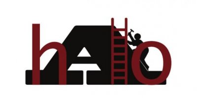
I have to say, I don't like that whole logo concept, halo over the 'A' or not.

It's hard to read and it doesn't really give me any impression I'd remember. I can see that it's a roof, but at a glance it pretty much looks like a dark blob to me.
 
I would rather you say it Mr. X. So we need to keep working on it to make it more "impressionable?"

Well, I'm obviously no expert, hopefully we can get MrsX to chime in here soon, since she used to get paid for this kind of stuff.

It's a creative graphic, I think it's cool. I just don't think it works as a logo. I think all of the stuff you have to throw in to make the 'A' recognizable as a roof doesn't work well as a small logo. The shingle pattern will probable get completely lost at smaller sizes, and the little roofer guy will be hard to recognize.

I'd have to see it, but I think it might be better if you got rid of the shingle pattern and the guy, and did something to make more contrast between the 'A' and the 'hlo' lettering.
 
I agree with what Mr. X said. I'll add that a general rule of thumb when designing a logo is that it should be clear and instantly recognizable when it's shrunk down to business card or letter head size. Mostly, and there are always exceptions, one color is the best, but two is okay. Any more than that it's starts getting too busy. Patterns and gradients generally don't shrink down well. What you have is a good concept, but you've got alot going on there. Here are some examples of some strong recognizable logos. In my opinion, the weakest of the bunch is Castle Bingo with three colors, and the sphere with the gradient that I can't read.

Client-Logos.gif


I think if you beef up the A, make it solid black drop out the "hlo" so it's white instead of red and play around with the guy so he's more substantial, that would be a start. Overall, I think it's a good direction.
 
Last edited:
make the A a brighter color, say yellow or green. Have the h and o off the ground, maybe resting on the curb that's part of A. I like the roofer on the A, that's nice.

Anyway, we wouldn't have this problem if you went with McRoofballs Roofing.
 
I think if you beef up the A, make it solid black drop out the "hlo" so it's white instead of red and play around with the guy so he's more substantial, that would be a start. Overall, I think it's a good direction.

Are you saying to beef up the "A" so that the "hlo" are within the A? Also to make the "hlo" outlined in the same color as the A and filled in white?
 
I agree mmike, $150 is very reasonable and was not a concern. We just started our own creations based off the thoughts I had and wanted to see if we could make it work. After making adjustments if I am not satisfied with it then I will go ahead and pay somebody else to do it.
 
what % you have to pay for workers comp in FLA?
here its like 45% for roofers:tully:
theres only about 2 companies that carry WC

I cant see how any roofing company could make a living paying those rates

I pay 12% and feel like thats to much
 
MCB, if you could put your logo in with the group MrsX put out there, it would get lost with the 2 she mentioned. IMO the A is too overpowering and the other 3 letters coloring darkness is too close to the A's color!

Every think of using red as the brick color. A bright, lively color and a brick's true color? Not many in MrsX's group use black. Black seems like a dreary color to be the main color.

Plus what colors you use now should IMO be thought of how they would look down the road as tee shirts, hats, etc. Think the h, l, o, should be bigger size wise to be closer to the A's size to see that it says Halo without much thought.
 
Are you saying to beef up the "A" so that the "hlo" are within the A? Also to make the "hlo" outlined in the same color as the A and filled in white?

If I was doing it, I would have a page full of theses and play around with different combinations. I would try to put the "hlo" so that they are within the A, but with the h and the o going outside so the A is "open" where the letters go off the A. The A needs to be taller and bigger, the focus of the whole thing. Right now everything is pretty mushed together. If I wasn't on this freaking punishment computer, I'd show you. Do another revision, and I'll see if I can put Illustrator on the upstairs PC and do some work on it if you aren't happy with what you're getting.

I think once you eliminate the pattern and color, you have to play around with the size and shape and see what works. Usually if I was working with a client at the initial meeting I would just talk and get the general direction or message they were trying to convey. If you haven't done that, it might (or might not) help you to clarify what specifically you would like the logo to convey. Strength, dependability, serious vs. fun, clean vs. playful. It seem like you've already got a clear picture, but if your having trouble now or when your working on it, it's a good list to revisit to help you refocus.

As a side note, it's no mistake that the BP logo is a really, pretty and clean flower looking thing.

After the initial meeting, I would go home and brainstorm and doodle pages of ideas. After awhile, three or four usually will stick our as a better direction than the others. I would flesh those out a little more and make them big, one on a page and go back to the client. If the initial drawing isn't feeling right to you, don't be afraid to branch off in another direction. I think your probably past this stage, but, whatever, maybe something in the process will help.

The client will usually be drawn to one or two of the choices. I would take it back and do another page of sketches of that particular logo slightly changes and at the next meeting, present three or four of the best incarnations of that logo, narrowing it down even more.

You get the picture. I think your at the stage where you've got all of your elements there that you want but the execution needs some work. I think taking that logo and treating it like a loose final and getting a few different incarnations of it will help you to see what's working and what isn't.

I will say, I see where you're going with the guy and the ladder, but you're going to have to really play with the shapes to keep the guy in the final cut. Right now if that logo was shrunk down, he wouldn't work visually and quite possibly look like a printing mistake.