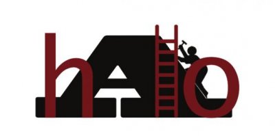
Are you saying to beef up the "A" so that the "hlo" are within the A? Also to make the "hlo" outlined in the same color as the A and filled in white?
If I was doing it, I would have a page full of theses and play around with different combinations. I would try to put the "hlo" so that they are within the A, but with the h and the o going outside so the A is "open" where the letters go off the A. The A needs to be taller and bigger, the focus of the whole thing. Right now everything is pretty mushed together. If I wasn't on this freaking punishment computer, I'd show you. Do another revision, and I'll see if I can put Illustrator on the upstairs PC and do some work on it if you aren't happy with what you're getting.
I think once you eliminate the pattern and color, you have to play around with the size and shape and see what works. Usually if I was working with a client at the initial meeting I would just talk and get the general direction or message they were trying to convey. If you haven't done that, it might (or might not) help you to clarify what specifically you would like the logo to convey. Strength, dependability, serious vs. fun, clean vs. playful. It seem like you've already got a clear picture, but if your having trouble now or when your working on it, it's a good list to revisit to help you refocus.
As a side note, it's no mistake that the BP logo is a really, pretty and clean flower looking thing.
After the initial meeting, I would go home and brainstorm and doodle pages of ideas. After awhile, three or four usually will stick our as a better direction than the others. I would flesh those out a little more and make them big, one on a page and go back to the client. If the initial drawing isn't feeling right to you, don't be afraid to branch off in another direction. I think your probably past this stage, but, whatever, maybe something in the process will help.
The client will usually be drawn to one or two of the choices. I would take it back and do another page of sketches of that particular logo slightly changes and at the next meeting, present three or four of the best incarnations of that logo, narrowing it down even more.
You get the picture. I think your at the stage where you've got all of your elements there that you want but the execution needs some work. I think taking that logo and treating it like a loose final and getting a few different incarnations of it will help you to see what's working and what isn't.
I will say, I see where you're going with the guy and the ladder, but you're going to have to really play with the shapes to keep the guy in the final cut. Right now if that logo was shrunk down, he wouldn't work visually and quite possibly look like a printing mistake.


 :
: